A Logo Design Process
As part of my site redesign I wanted new branding. It’s not really a logo I guess, but it’s what I’ll be using on this site and any other promotional crud that I make like business cards. This was a fun process that let me dive deeper into hand-lettering than I have before. Here’s a look into the design of the new logo from pencil sketch to final (enough) image.
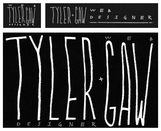
I’m not trying throw out everything and start from zero. Because of that, my first step was look at what I have now. My current logo appears in three variations. The largest appears on my homepage. On medium size screens a smaller, stacked version with "web" on top and "designer" below my name is shown. On small screens, a side-by-side version with my name on the left and "web designer" on the right is shown.
I always start as rough as possible. I grabbed the "Tyler Gaw" portion of the existing logo and plopped it into a new PSD. I didn’t have a plan for what I’d do with the logo so just started typing out different titles next to it in different typefaces to get things rolling. I tried side-by-side, top and bottom, serifs, sans-serifs, handwriting, pulling, prodding, stretching, scaling, etc. I let myself play and make as many ugly messes as I could.
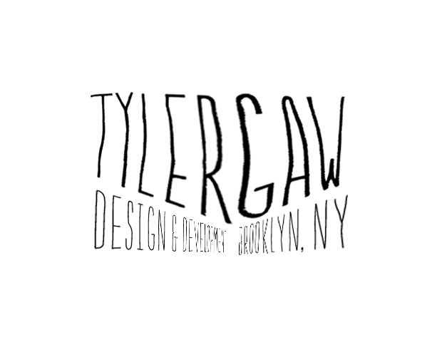
After a good amount of messin’ I landed on something that definitely wasn’t ready, but felt like a good path. My name with "Design & Development" and "Brooklyn NY, USA" below it. I added a slight angle to both sides to make it a more interesting.
The image below shows that everything was out of whack, it’s not even fully readable. That was OK. It was enough that I could see where I wanted to go with it.
In the existing logo I refer to myself as a "Web Designer". That feels like an accurate title because I design and write code, but I wanted to be more clear so I went with "Design & Development". Using "Web Designer" as a title I often have to answer; "no, not only design. I write code too".
Back to Sketching
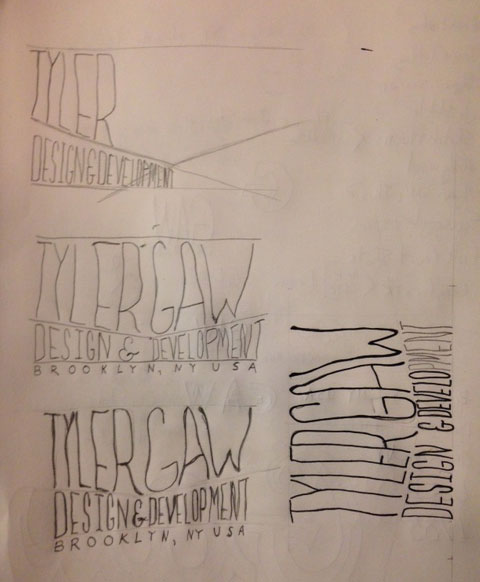
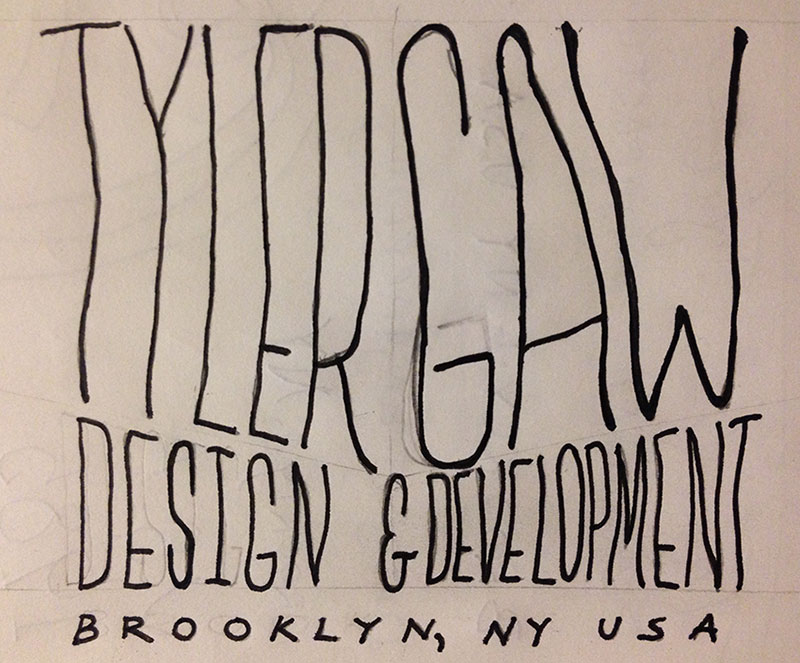
The next step was to get off the computer and do some sketching. I gave myself some loose guides to follow for the width/height and for the shape the text would be in. I redrew the same thing five or six times until I got one that was close enough.
Moving Into Illustrator
I brought the close enough sketch into Illustrator and live traced it. The conversion to vector was as good as could be expected. With any hand-drawn text there are a lot of unneeded and rough points.
I did a pass where I cleaned up the spacing and removed many points to make the letters of "Design & Development" smoother. In the image below you can see some sharp edges in places on the "Tyler Gaw". Those were caused by me changing the height and rotation of different letters and portions of letters.
When I thought I had the basic size and shape where I wanted it I brought it over to Photoshop and placed it in a very early layout of the new site.
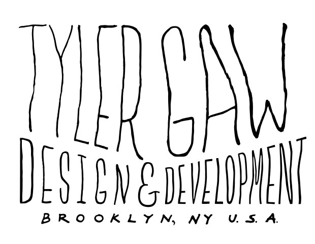
This felt wrong. It was too spindly. I didn’t feel like it was standing up on its own. Felt like it could get lost easily at smaller sizes. I wanted it to feel more involved, more interesting, just more.
"What if I add some serifs?" I asked myself. I started with the "D" in "Design". I widened the stroke and added slight serifs to it. That’s what it needed. With that small change I could tell immediately that this was where it needed to go. That also let me know that I was in for a whole lot of tedious work as I would have to take the same steps for each letter.
The Work
It took me about about fours days to update all the letters. I always started by removing as many points as possible. A general rule I figured out was mo’ points, mo’ problems. Fewer points allow for smoother curves and fewer pinches and nicks where they aren’t wanted. After deleting the points it was a matter of moving them around until the stroke width and serifs matched the rest of the letters. I used some loose guides to keep the serif sizes similar, but since this is supposed to have a hand-drawn look I could take liberties with them.
The removing, adding, and moving of points feels a lot like working with clay. You start with these rough shapes and you slowly push and pull and smooth it into the shape that you’re looking for. I’ve written about this process before for Slenderman. For some reason it felt more like chiseling rock that time.
As a way to check that things were shaping up correctly and as a break from tedium, I would often bring the logo into the rough layout in Photoshop. Looking at it as a raster image at the approximate size it would be displayed helped me make sure it was readable and looked how I wanted it. I worked on the letters in bursts. I would do a letter, maybe two. Then stop, get some air. Move it to Photoshop, check it, repeat.
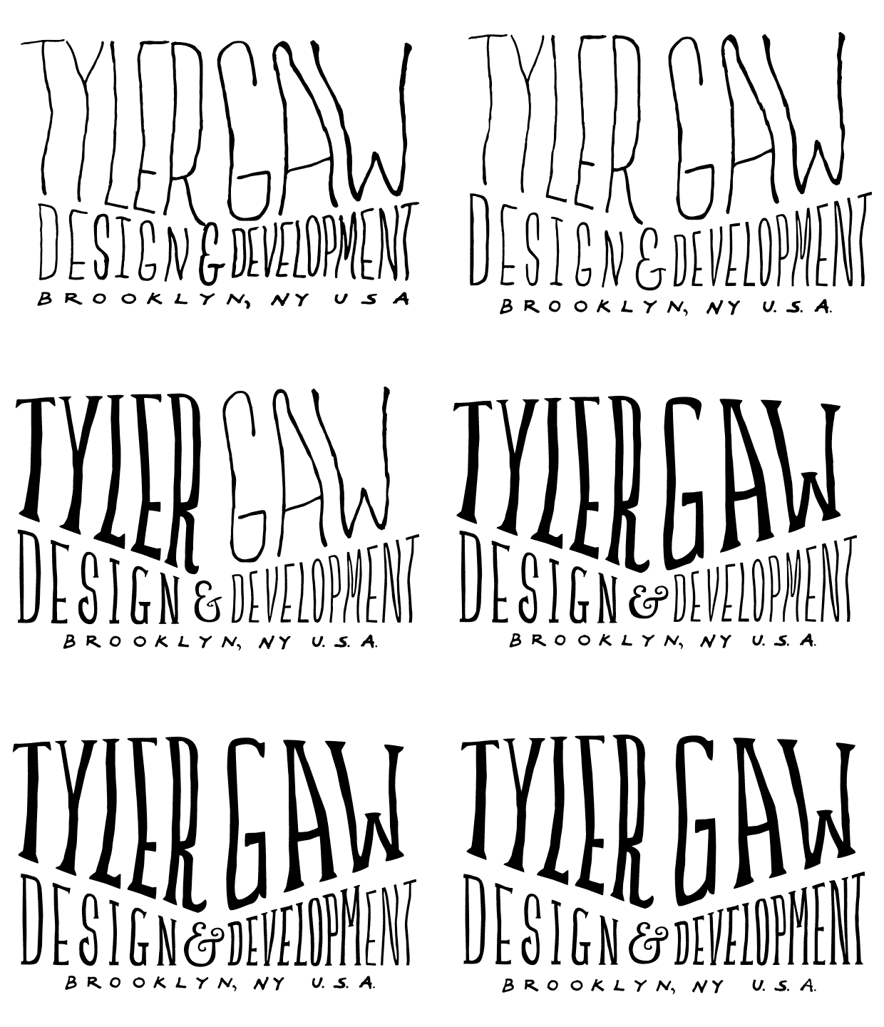
I’m happy with how it’s turned out. I’m also working on colors for the redesign so I added bits of color to the logo and put it up on Dribbble for feedback. From the beginning I’ve had my brain set on a red for some reason, but all of the feedback points to yellow. I’ve been playing with yellow as an accent color for the the rest of the site and it feels like it’s working so far.
Here’s a final (as-of-right-now) version of the logo embedded as SVG. I removed the yellow drop shadow from my name that is shown in the Dribbble shot. It was kind of cool, but didn’t feel necessary. I think I can get more mileage out of the logo without it.
I’m looking forward to working with the logo more. Keeping it vector was important for me because I want to display it using SVG. I also think there will be some interesting things to do with it using CSS transitions and animations further down the road.
Thanks for reading